904 Tacos
UX Redesign Mobile Menu
Case Study by UX Designer Demi RamosRole
Duration
UX Designer
4.5 weeks
904 Tacos is a restaurant located in Jacksonville, Florida, that is surrounded by colorful decor, lively music, and tasty prepared cuisine.
The purpose is to make an interactive mobile menu online for users who enjoys looking at menu’s online before getting to the place, or during.
Role and Responsibilities :
My role in this project included UX Researcher, UI Designer, usability testing, wire-framing low to high fidelity, prototyping, and user interviews, etc
The Challenge
904 tacos website only provides a PDF menu, and the link does not work on their website, so it must be looked up separately. Users experience difficulty accessing or engaging with restaurant menus online in a way that is efficient, enjoyable, and informative, either prior to arriving at the venue or while they are already there.
Problem Statement
Our user is an ‘appetizer’ girlie who enjoys going to the gym and watches what she eats when going out to eat who needs to see nutritional value preferably on an interactive menu, to see pictures and caloric information in order to make an informed decisions and maintain the healthy lifestyle.
Solution
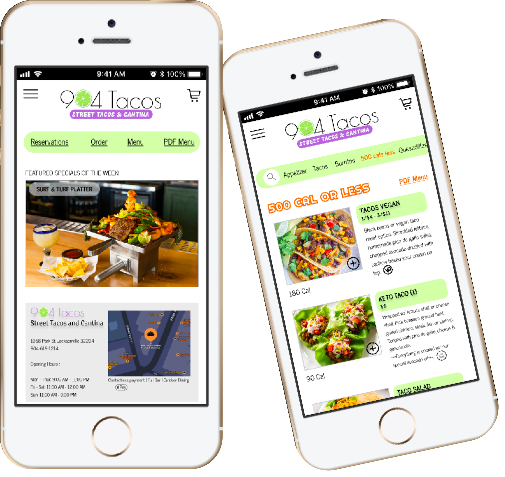
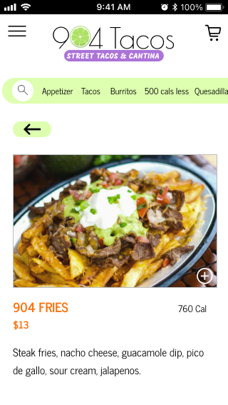
Create an interactive mobile menu that provides plenty visual aids, descriptive details of the entrees, and caloric informations that users will find helpful when looking up either on the way to the restaurant or anytime.
The Design Process
1
2
3
4
Research & Discovery
Ideation & Design
Testing
Results
Phase 1 - Research & Discovery
I conducted user interviews to start the process with 3 candidates.
Here is what I discovered,
USER PERSONA 1
Reyna is currently studying at UCF to get her associates in nursing, while she does part-times as a server to help pay for nursing school. She is currently single and tries to go out as often as she can with her friends, but work and studies comes first.
Reyna Garcia
21 years old
Server
Single
Orlando, FL
GOALS
Be able to view a PDF menu that is straightforward with the items before going out to the restaurant and have a good experience with it.
Easily identify where the appetizer is on the menu.
Have key legends on menu since spicy and raw food is not her thing.
FRUSTRATIONS
Dealing with interactive menu that has many categories that requires to go back and forth with the page, followed by slow wi-fi.
No key indication on some menu if item is raw or spicy
When menus are disorganized and the appetizers are not clear where it is located, or not advertised first on the menu.
“I enjoy going out to eat but I always check the menu before going to the place to make sure they have something I like, otherwise I don’t bother going..”
USER PERSONA 2
Engaged to high school sweetheart and got into fitness after graduation. Always tries to calculate calories when going out, and keep track of protein intakes. Usually meal preps but when going out to eat, he tries to watch what he’s eating. Sticks to Vodka & Water with lime when drinking out.
Andres Leon
24 years old
Fitness Instructor
Engaged
Austin, TX
GOALS
View a menu with nutritional information on it or its own section of low calorie options.
An interactive menu that categorizes entrees from appetizers to desserts.
Appreciates pictures on menus to figure out portion sizes.
FRUSTRATIONS
No nutritional information on online menu’s when viewing
Dislikes one page PDF menu = takes too much time trying to find labels for entrees
Only descriptions of the entree, no visual design of the items.
“Fitness plays a huge role in my life so I make sure I watch what goes in my body.”
MoSCoW
Must Have -
Menu has dietary restrictions option
The menu has nutritional information of the entrees and caloric information
Menu includes prices for every item, including add ons
Menu includes main ingredients and allergens
Should Have -
The menu has visuals of the items
Menu includes key legends to indicate symbols
Menu includes a section for ‘skinny-menu’ that is 600 calories or less
Won’t Have -
Menu includes least to favorite meals by costumers
Menu includes AI suggestions
Menu includes ratings of each item
Could Have -
Menu includes big header and colorful fonts to categorize items
Menu is one page PDF
Menu includes drinks that pairs well with the entree
Menu includes appetizer that pairs well with drinks for happy hour time
User Flow
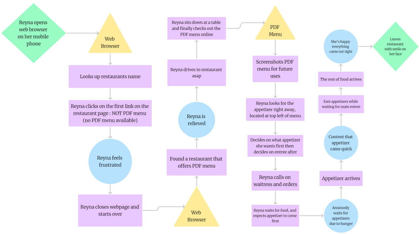
Reyna’s User Flow
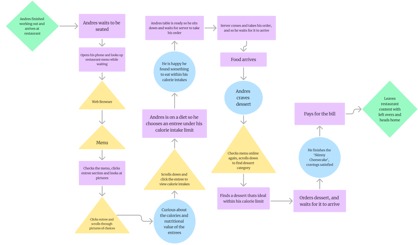
Andres User Flow
Research & Discovery
Ideation & Design
Testing
Results
3
1
2
4
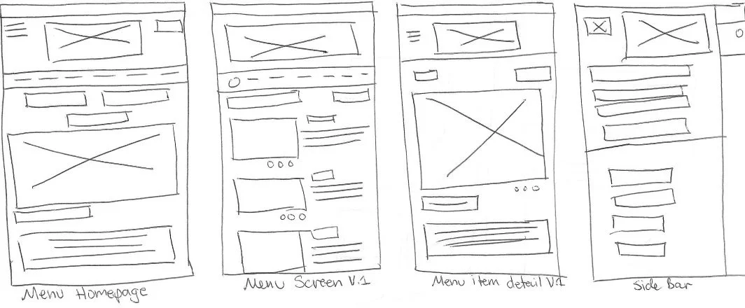
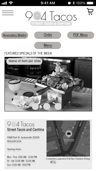
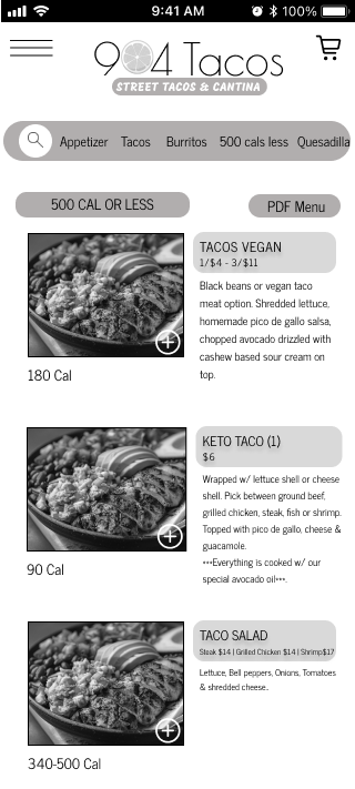
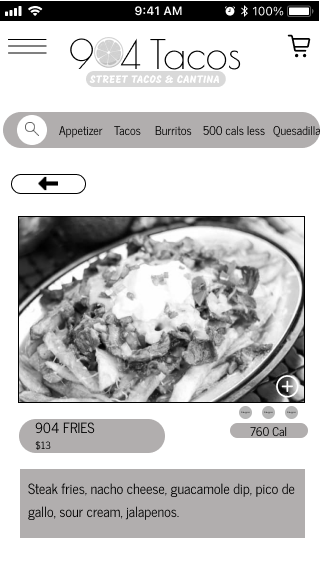
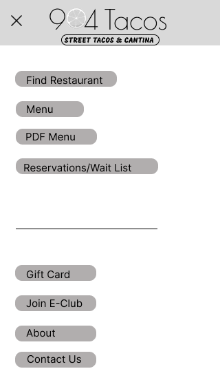
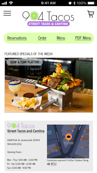
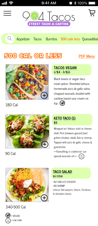
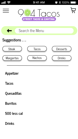
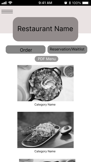
These are the 4 finalized low-fi wireframes for the interactive mobile menu.
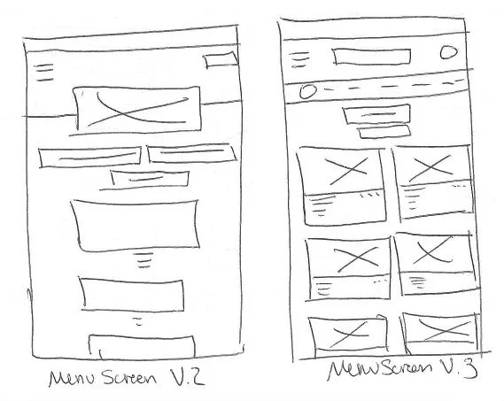
I have sketched out 3 different menu screens versions, and these are the other two choices I had
Menu Screen V.2 | Menu Screen V.3
Phase 2 - Ideation & Design
I got the inspiration to draw these wireframes by looking up basic interactive menu’s online, and redesigned it to see which fits the best through usability testing.
From paper sketches to digital
low fidelity wireframes
Mid Fidelity Wireframes
High Fidelity Wireframes
Research & Discovery
Testing
Ideation & Design
Results
1
2
3
4
Phase 3 - Testing
Usability Testing
I have conducted usability testing with 3 candidates
and here are the results
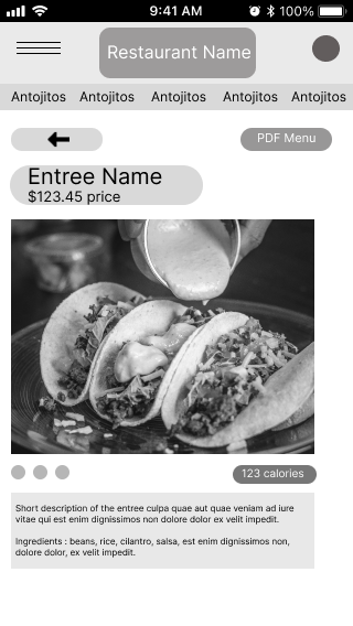
Originally, I have put the PDF Menu option on the top right corner for easy access.
-
Entree name and prices was placed on top of the picture, followed by the calorie intake on the bottom right of the picture.
Before usability testing
“It is easier to read when the numbers are within eye level.”
- User 1
AFTER usability testing
Users finds it unnecessary to have another PDF Menu button on every screen, and to just leave it alone on the main menu page.
This wireframe was one of the 3 choices users had chosen, at first it looked simple.
But too simple.
Lack of details.
After testing, users have noticed that it is better to have detailed description per item instead of just a picture.
User has also noticed that it is better to have the categories on the header for quicker access, and it gives them a chance to roam around and navigate the website for further use.
Research & Discovery
1
Ideation & Design
2
Testing
3
Results
4
Phase 4 - Results
Throughout this case study, here are couple of things I learned.
Users are into visual aids, caloric informations, and short item descriptions when it comes to viewing a menu.
Visual Aids
Visual elements like icons, images, or highlighted sections make it easier for users to understand and navigate the menu, especially when it contains complex information.
Improve Accessibility: For users with language barriers or cognitive disabilities, visual aids can bridge gaps in understanding, making the menu more accessible to a wider audience.
Increase Engagement: Attractive visuals draw attention and make the experience more enjoyable. Images of food, for example, can entice users and influence their choices by providing a preview of what they can expect.
Speed Up Decision-Making: Visual aids help users quickly scan and identify categories or items they are looking for, reducing cognitive load and improving the overall experience.
“I find it hard to fully visualize what I’m ordering just from the descriptions. Seeing pictures makes it so much easier to decide and helps me make better choices.”
Caloric Information
Caloric information is important for users when viewing a menu because:
Informed Choices: It allows users to make more informed decisions about what they're consuming, especially if they're watching their calorie intake for health or fitness goals.
Supports Dietary Goals: For individuals on specific diets (e.g., weight loss, muscle gain, or maintaining a balanced diet), knowing the calorie content helps them stay on track with their nutritional targets.
Transparency: Providing caloric information offers transparency, helping users trust the restaurant or service more as they feel empowered to make decisions that align with their personal health needs.
“I go to the gym a lot so I’m often watching what I’m eating and how many calories is in the dish or portion sizes”
Item Description
Entrée descriptions are important for users when viewing a menu because:
Clarifies Ingredients: Descriptions provide key details about the ingredients, helping users know exactly what they’re ordering, especially if they have dietary preferences or restrictions.
Sets Expectations: A well-written description paints a mental picture of the dish, allowing users to anticipate flavors, textures, and portion size before making a decision.
Assists with Decision-Making: For users unfamiliar with certain dishes or cuisines, descriptions offer crucial context that helps them make confident, informed choices.
Before
The menu online is only PDF, not interactive
No pictures, users are not as fully engaged with the menu.
No caloric information, users who are watching their diet are not able to make an informed decision to fit their eating habits.
It is only one page, so it looked too compressed and too much information to read in one page.
Lack of description per item.
After
User finds it easier to navigate an interactive mobile menu and easier to find specific items while scrolling through.
Visual aids help users quickly scan and identify categories or items they are looking for.
Users are more encouraged to choose healthier options or adjust portion sizes to better fit their lifestyle when seeing caloric counts
By providing important context, entrée descriptions guide users in choosing dishes that align with their tastes and needs.
Interactive Prototype

