Blink Camera System
UX Redesign App
Case Study by UX Designer Demi RamosRole
UX Designer
Duration
4.5 weeks
The Blink camera system, owned by Amazon, offers a range of smart home solutions with notable features that keeps your home safe such as
Wireless Designs
High-Definition Video
Motion Detection and Alerts
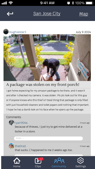
The purpose is to redesign the blink app to enhance users experience such as creating an easier access to quickly disarmed/armed through a widget, and input a community section to gain insights within the neighborhood.
Role and Responsibilities :
My role in this project included UX Researcher, UI Designer, usability testing, wire-framing low to high fidelity, prototyping, and user interviews, etc
The Challenge
The Blink app needs to be redesigned to improve its ease of use, enhance real-time security feedback, and offer personalized, seamless control, ultimately creating a more intuitive and reassuring user experience.
Problem Statement
Our user is someone who prioritizes safety who needs faster loading time to view live footage and easier way to access the disarmed option in order to have a positive experience and feel at ease in their household whether they are away from home or from the comfort of their couch.
Solution
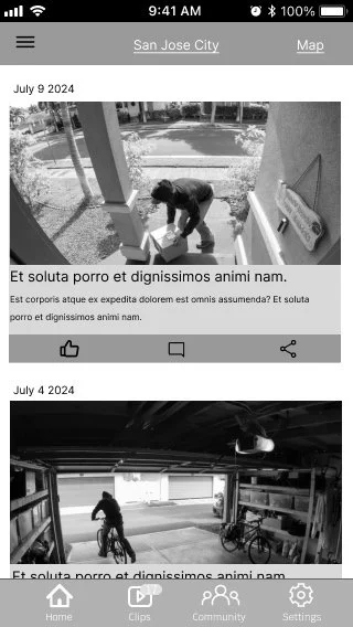
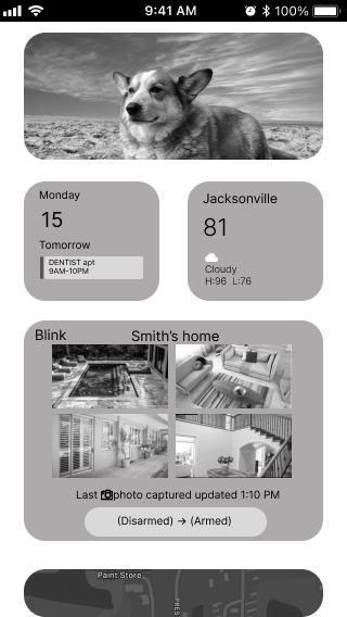
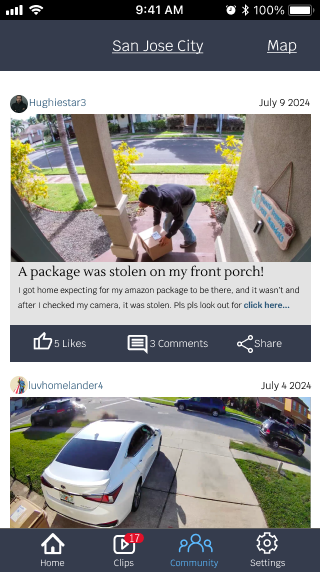
Redesign the mobile application that provides an easier access to quickly disarmed/armed through a widget, and add a community section to gain insights of what is happening in the community that has the same blink system.
The Design Process
1
2
3
4
Research & Discovery
Ideation & Design
Testing
Results
Phase 1 - Research & Discovery
I conducted user interviews to start the process with 3 candidates.
Here is what I discovered,
USER PERSONA 1
Richard has been married for 15 years and a father to two boys who has been in the photography industry for 10 years. He travels often for work so he relies on home security camera to watch and communicate with his family back home when away. He is an outgoing person and loves communicating with people.
Richard Gonzales
35 years old
Photographer
Married
Los Angeles, CA
GOALS
View live video right away in real time with no dilemma or no more than wait time of 5 seconds.
Receive a text message notification for any emergencies from the security system app, not through the app.
An inexpensive security system that offers a cloud and back-up storage.
FRUSTRATIONS
When viewing live footage from motion detected notification, it buffers for way too long so it prevents from seeing real time footage.
Wish to view recent footage without needing Wi-Fi, or have it already loaded.
Price is too high to be able to afford the pro that includes back-up storage and offline usage.
“I travel for business sometimes, and it’s a great feeling to know I can view my home from my phone anytime, anywhere and know my family is safe.”
USER PERSONA 2
Faith is a cake decorator that does life insurance on the side to have extra income. Has 3 grandchildren who she adore and babysits them sometimes at her house, but her neighborhood is not the best so having a camera system makes her feel safer. Loves to do karaoke, and host dinner/parties at her house to spend time with family.
Faith Johnson
54 years old
Cake Decorator
Married
Jacksonville, FL
GOALS
Be able to view any live footage or recordings from the app in real time with no wait for more than 3 seconds
An option to have the disarmed button on the phone home-screen for quicker access
Capture moments on the security camera app through motion detection when posting parties
FRUSTRATIONS
It takes more than 10 seconds for live feed to load and view footages on the app
Too many buttons to go through and loading time from the app to disarmed the system right away
Sometimes the motion detection does not capture every moment if its armed, or catches irrelevant recordings of animals or the wind which causes false alarms
“It is essential to own a security system due to the kind of neighborhood I reside at considering I babysit my grandkids sometimes...”
MoSCoW
Must Have -
Back-up storage you can view playback videos when offline, no need of wi-fi
Camera system in app includes disarm/armed button on mobile homescreen page for quicker access
Quick view of the live feed from the main home screen of the mobile device
Should Have -
Camera system in app includes a quick button to 9-1-1 incase of emergencies
Authentication process every time you open the app
Receive a text notification through messages AND in-app notification for any alerts
Won’t Have -
An option to view live feed shared publicly by neighbors/local users
Get an AI call for alerts
Get an AI to analyze false motion detection before alerting
Could Have -
An option to send link your live feed to friends and family
View weather in the camera system app
Have a community chat/alerts in app for nearby incident reports
User Flow
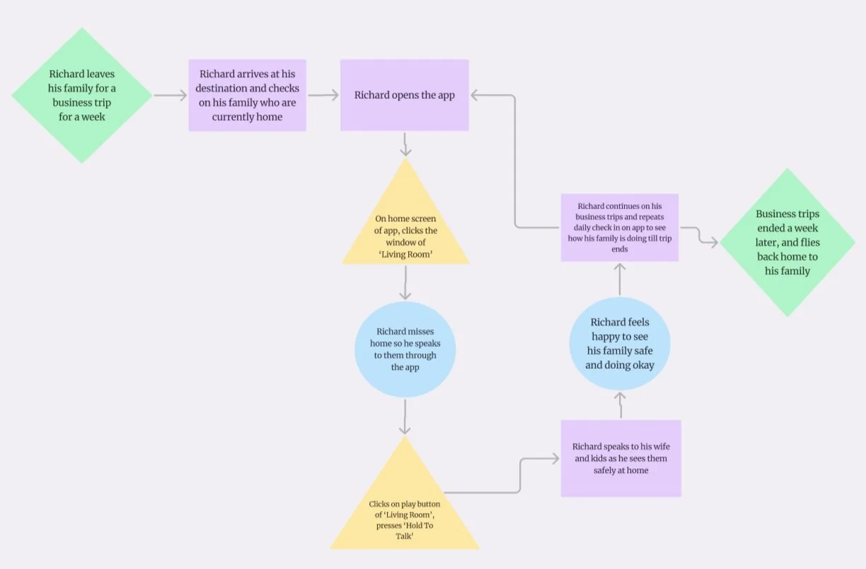
Richard’s User Flow
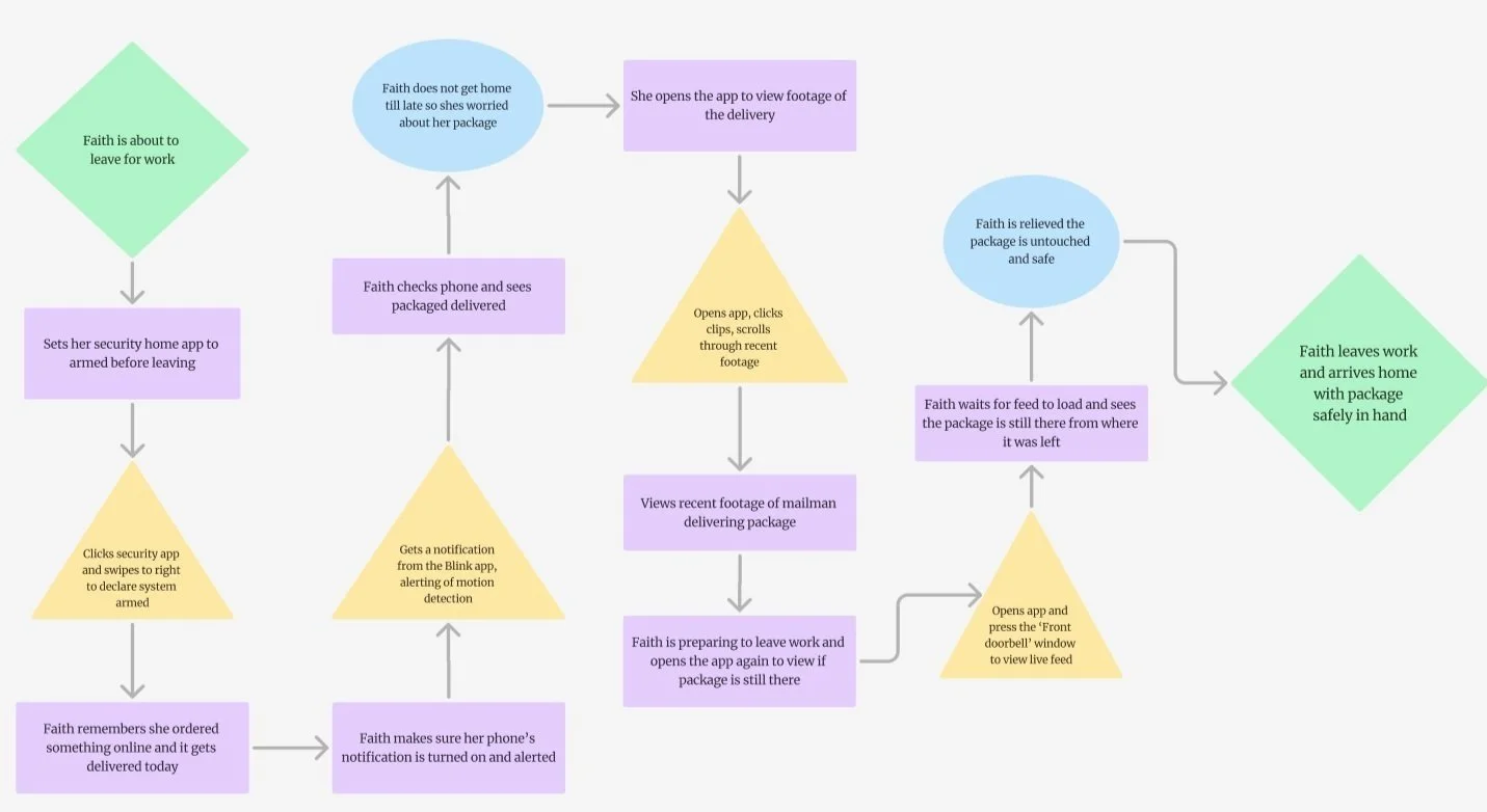
Faith’s User Flow
Research & Discovery
Ideation & Design
Testing
Results
3
1
2
4
Phase 2 - Ideation & Design
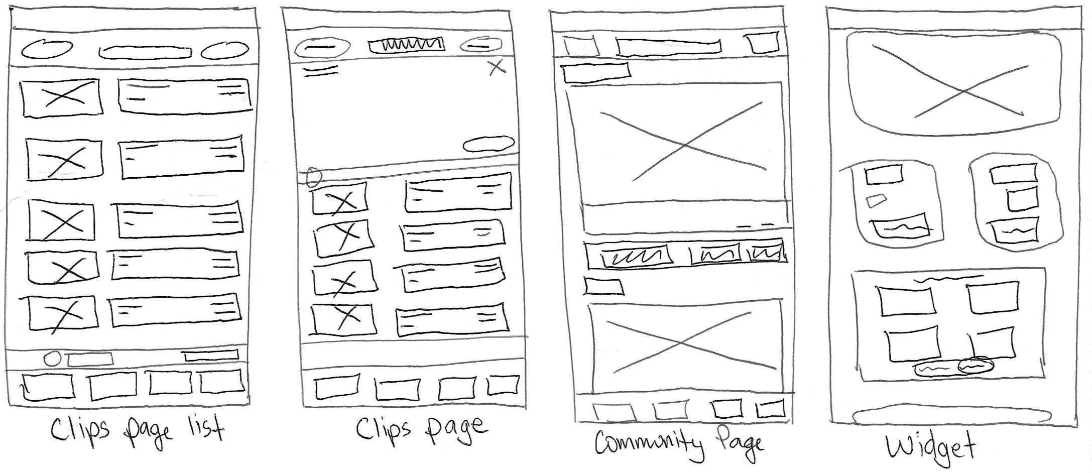
These are my finalized low fidelity wireframes I did on paper to showcase the beginning of the ideation and design process. I have done a few sketches on paper and I have chosen these 5 main wireframes to get the process started.
From paper sketches to digital
low fidelity wireframes
Mid Fidelity Wireframes
High Fidelity Wireframes
Research & Discovery
Testing
Ideation & Design
Results
1
2
3
4
Phase 3 - Testing
Usability Testing
I have conducted usability testing with 3 candidates
and here are the results
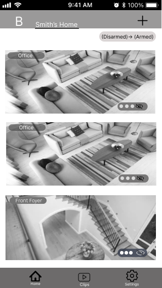
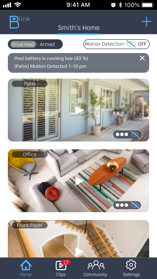
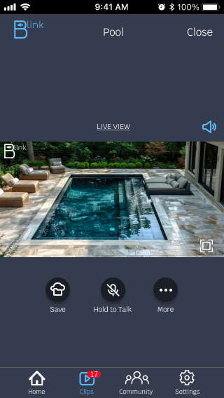
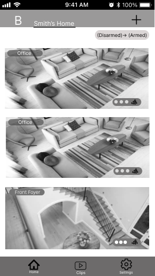
Originally, I followed the same format as the original blink app, and had it placed like this, however after usability testing, 2 out 3 interviews agreed they do not like the empty space in the middle.
Before usability testing
“It helps fill up the screen better and helps me pay attention more to what I’m watching” - User 2
AFTER usability testing
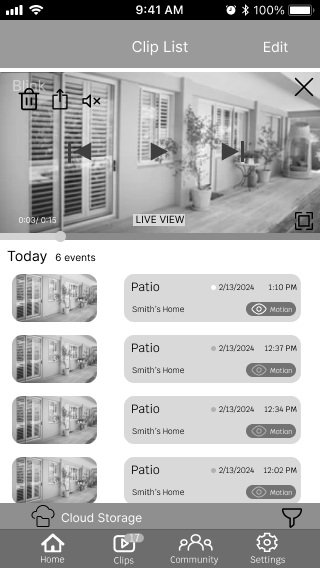
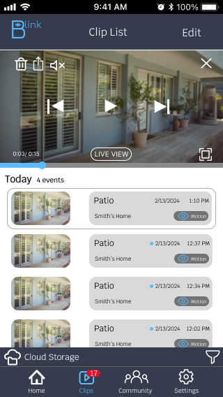
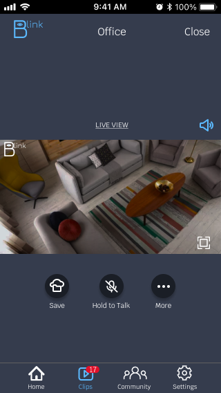
Users would rather see the video played in the middle of the screen.
It also makes it easier for them to press the middle button (microphone) to talk into to the screen.
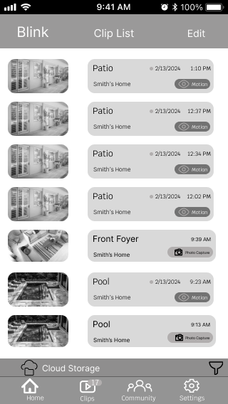
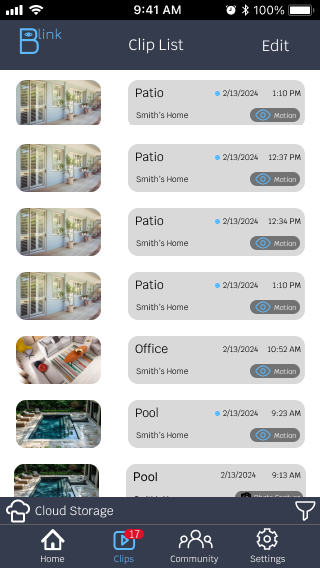
I have indicated the running man as as the logo for motion detection, the same as the original blink app.
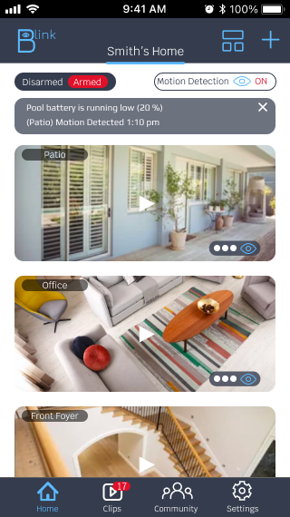
All users have agreed that it is better to use the eye logo since using an ‘eye’ logo makes it more known and obvious that the camera is watching for any movements.
This change helps users pay attention more and remember that the motion detection is on.
Research & Discovery
Ideation & Design
Testing
Results
2
1
3
4
Phase 4 - Results
Throughout this case study, here are couple of things I learned.
Users are into color scheme relating to security and privacy. I have concluded that red associates with
Alertness and Awareness
Red is often associated with warning signals, making users more alert and aware of potential dangers. This can heighten a sense of vigilance.
Urgency
Red can create a sense of urgency or prompt immediate action, which may be beneficial in contexts like emergency alerts or critical notifications.
Before
User finds it annoying when the app does not load fast enough to disarmed/armed system
User is clueless what is going on in their community when incidents happen.
User is annoyed with the long wait time for the video footage/live footage to load.
User 1 prefers to see armed/disarmed option on front home screen of her mobile device for easier/faster access when leaving the house so no need to wait for app to load.
User sometimes forget if they have armed/disarmed the system.
After
User finds it easier and faster to armed the system by having that option on a widget on their homescreen.
After implementing the community page in the app, users are now able to share any incidents that happens to their property to raise awareness and feel safer with having more knowledge about their neighborhood.
After changing the armed/disarmed visuals, user are more prone to remember if they had armed the system due to the color scheme of the button.
“As someone who is older who wears glasses 24/7, seeing the color red when arming my system, makes it easier for me to remember and see better.”
Interactive Prototype

